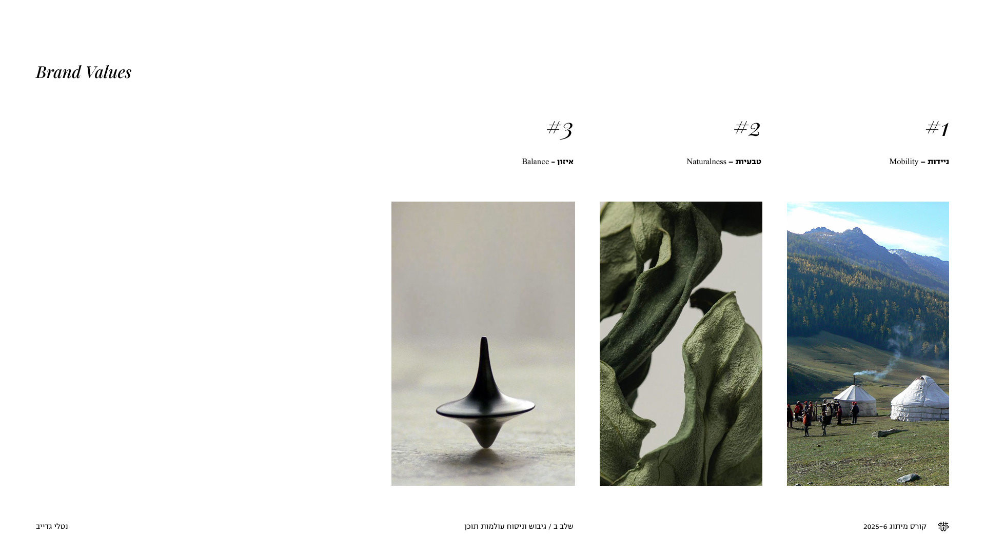
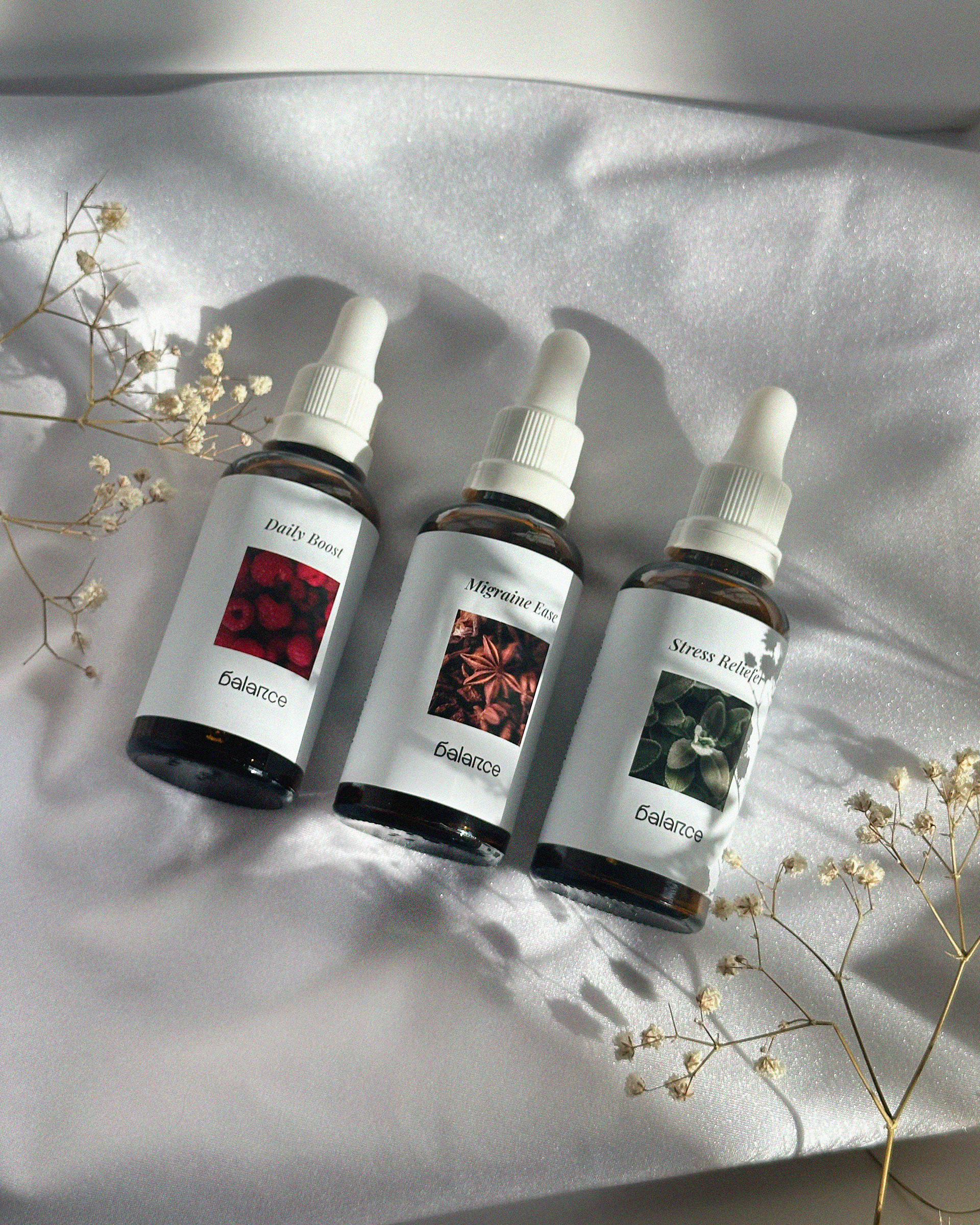
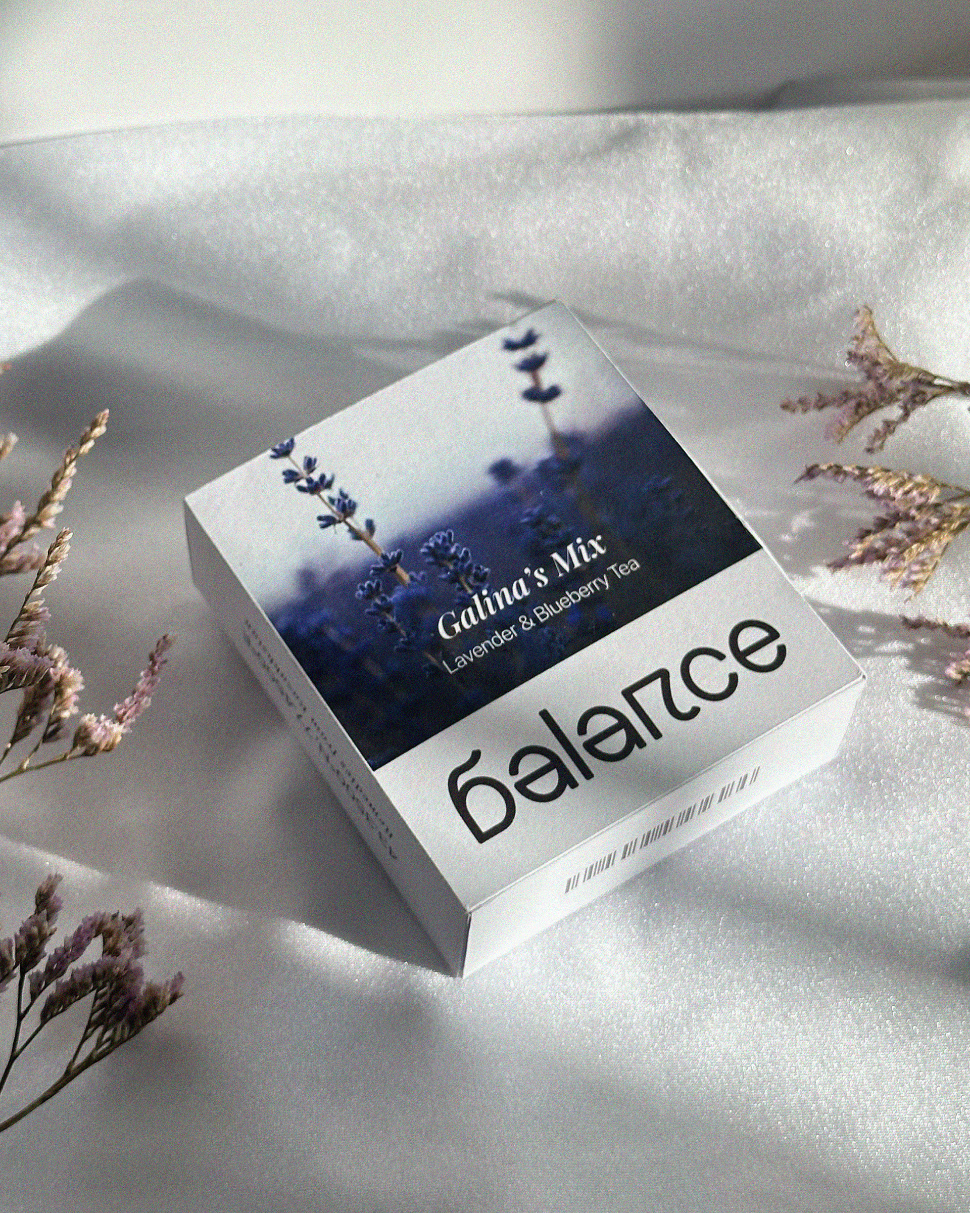
BALANCE
Brand Identity / 2026
Tools [ Illustrator, Photoshop ]
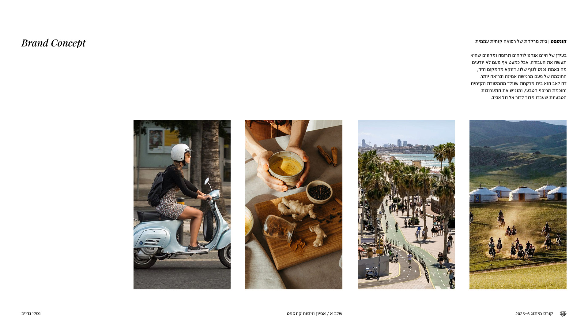
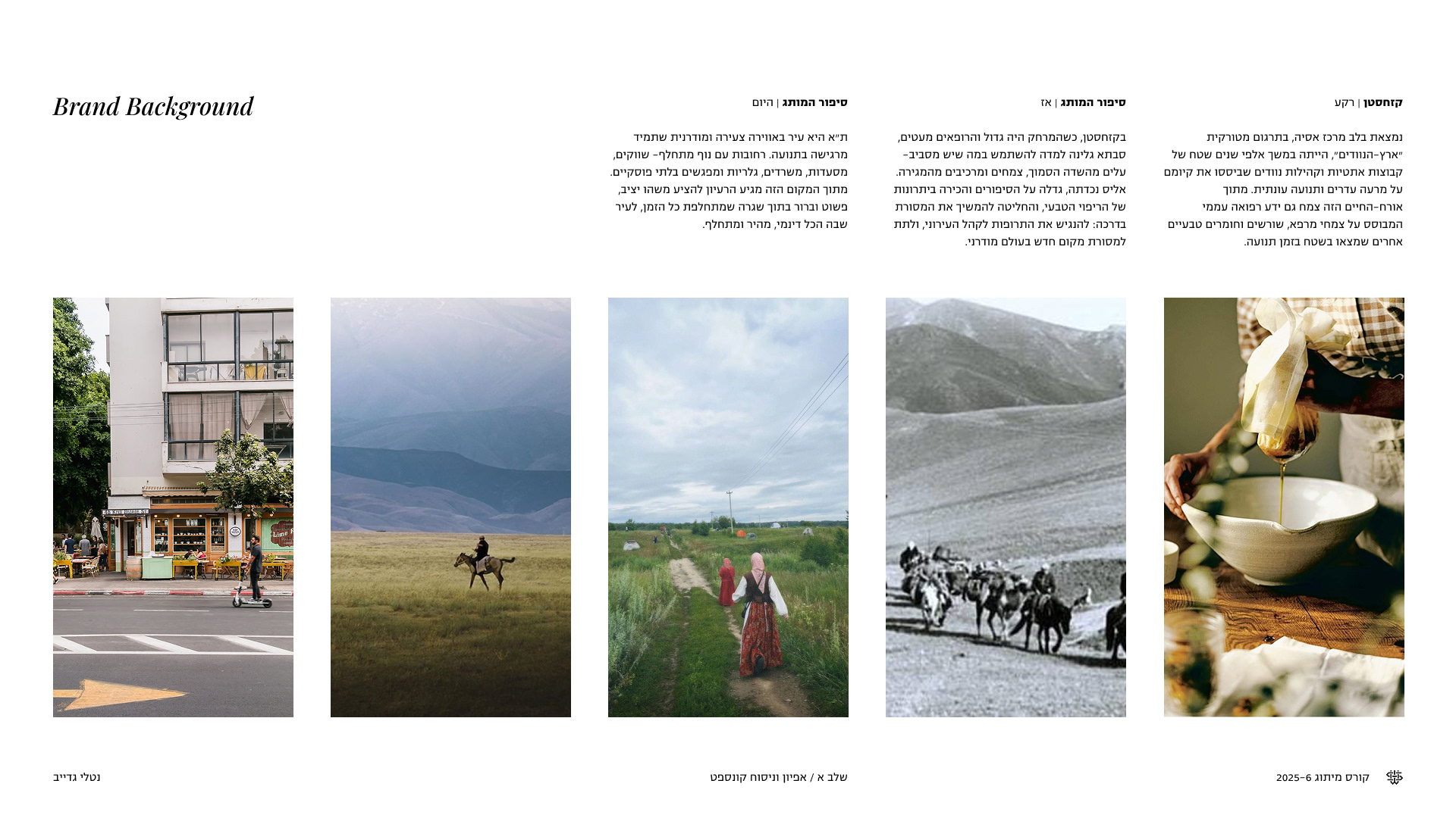
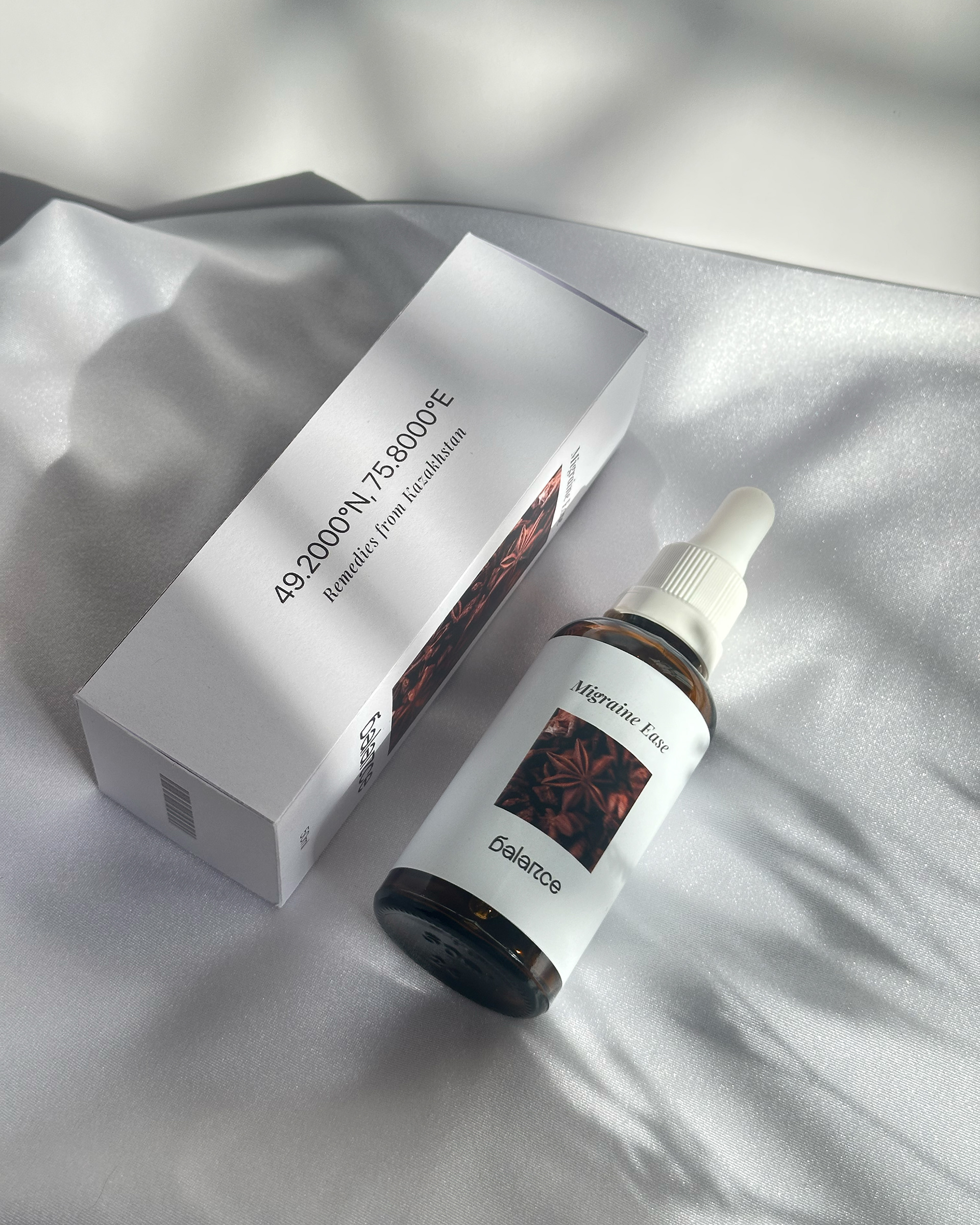
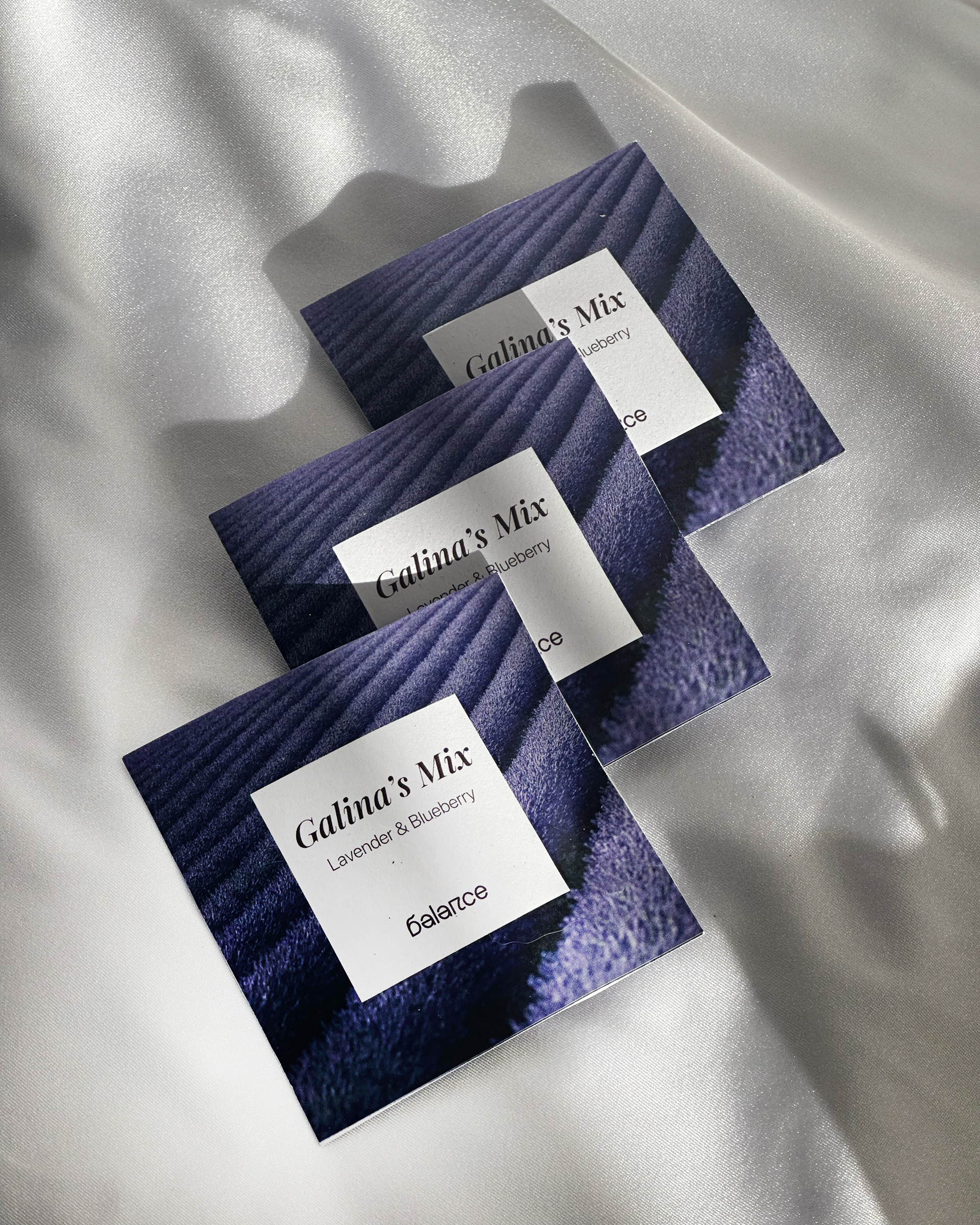
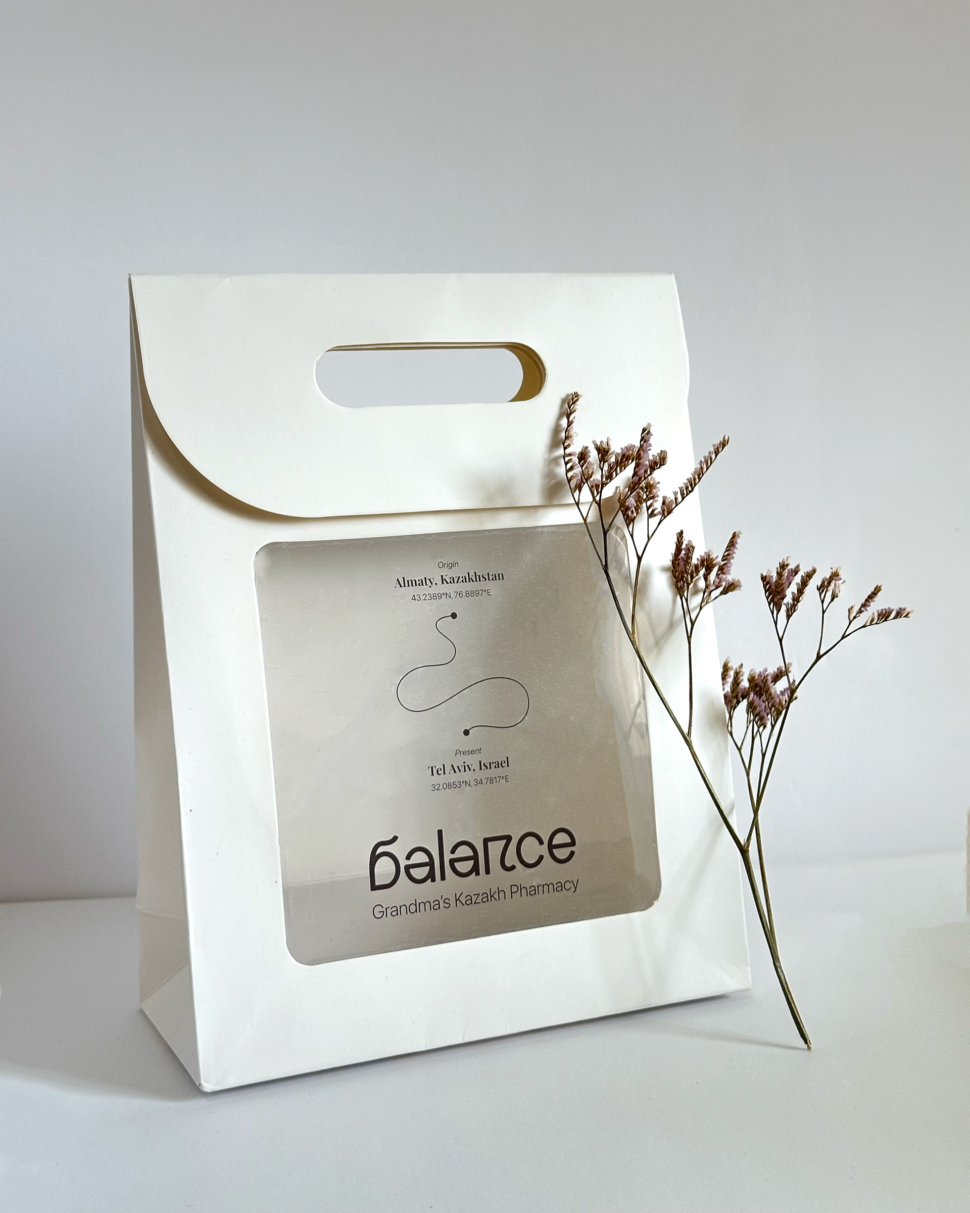
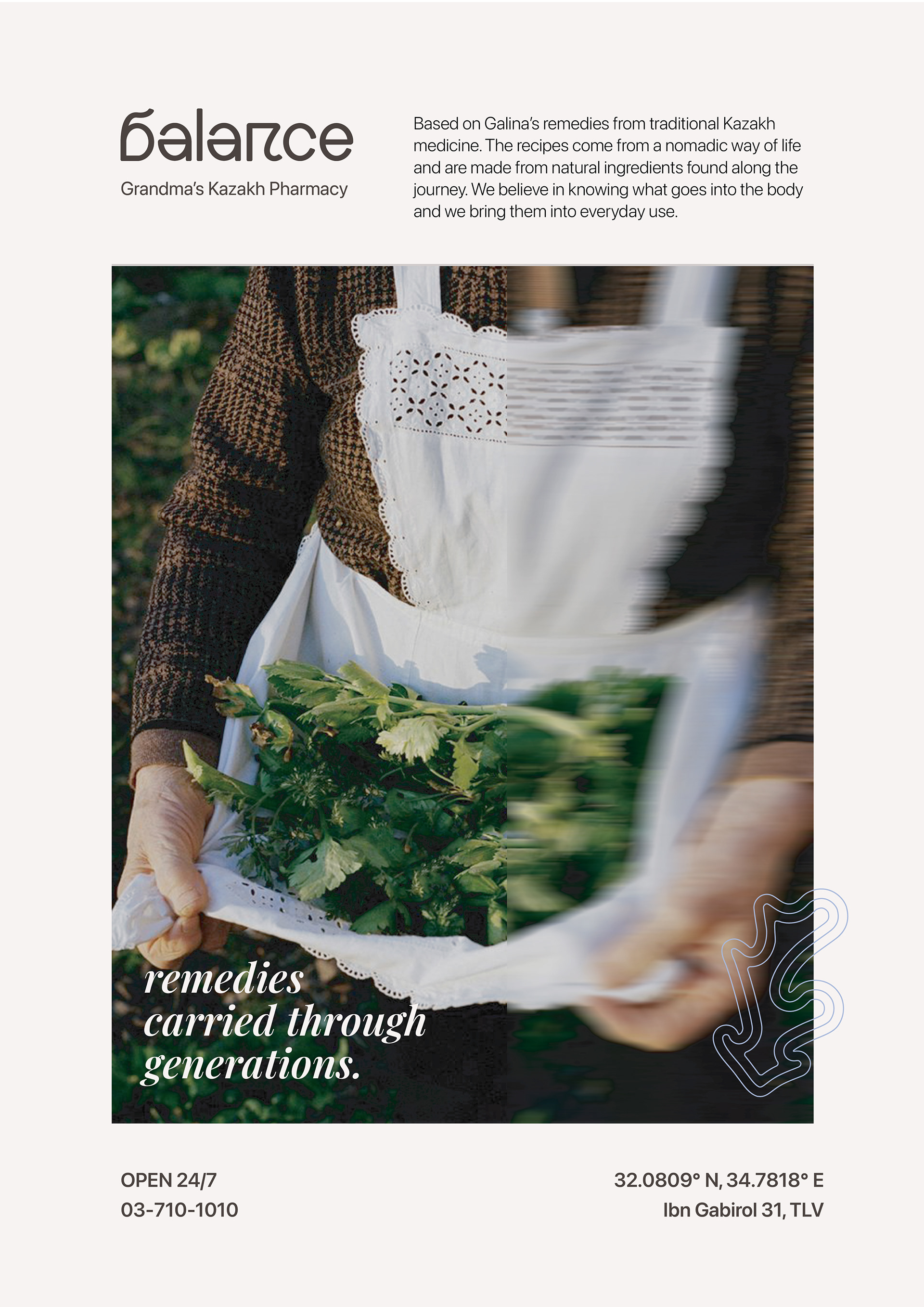
Visual identity for a wellness brand based on traditional home remedies from Kazakhstan. The concept brings familiar remedies, ingredients, and healing rituals from Kazakh culture into a contemporary local context, making them more accessible and understandable to a new audience. The visual identity translates this meeting point between heritage and everyday use into a clean, balanced, and approachable brand language.

LOGOTYPE & Design language
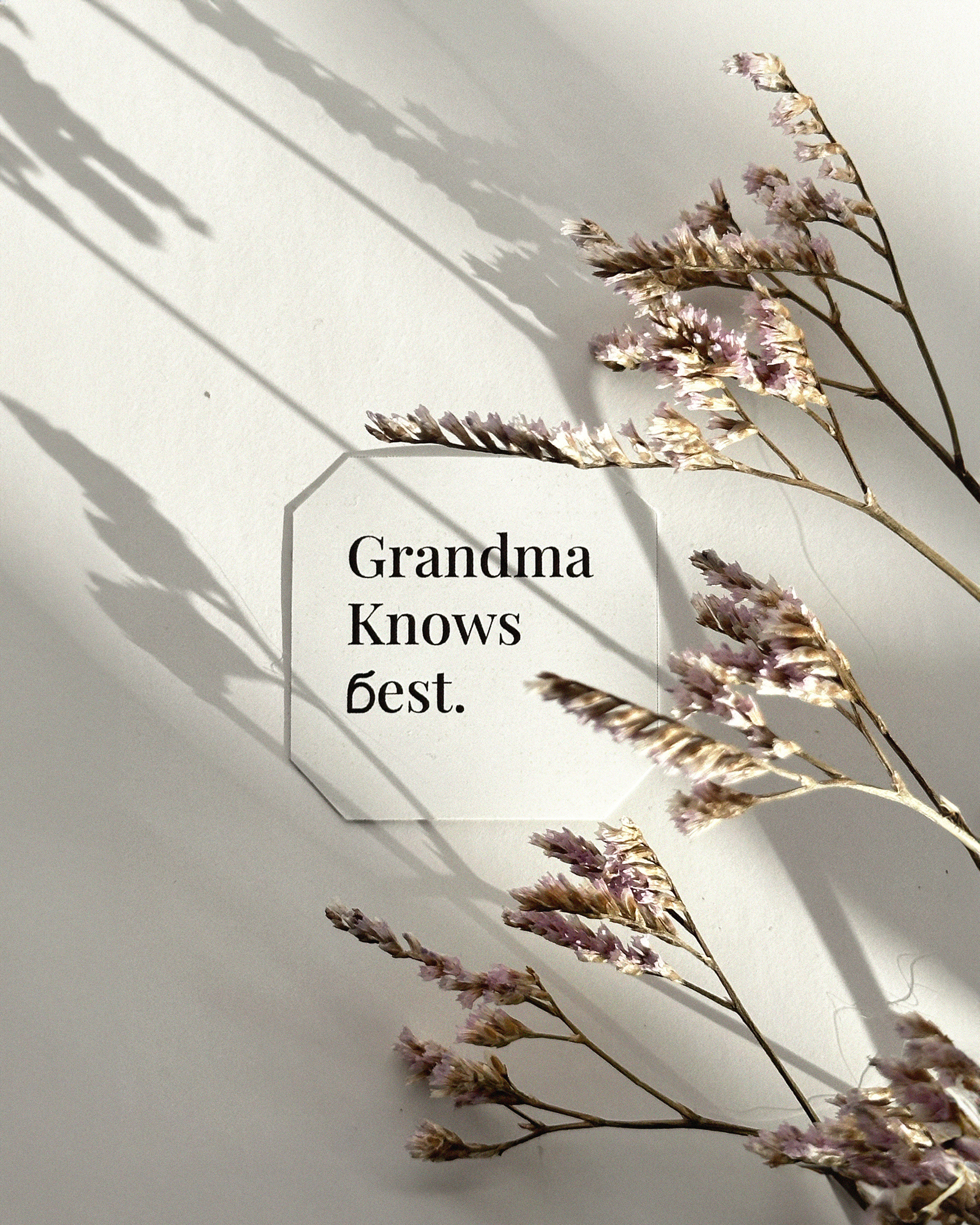
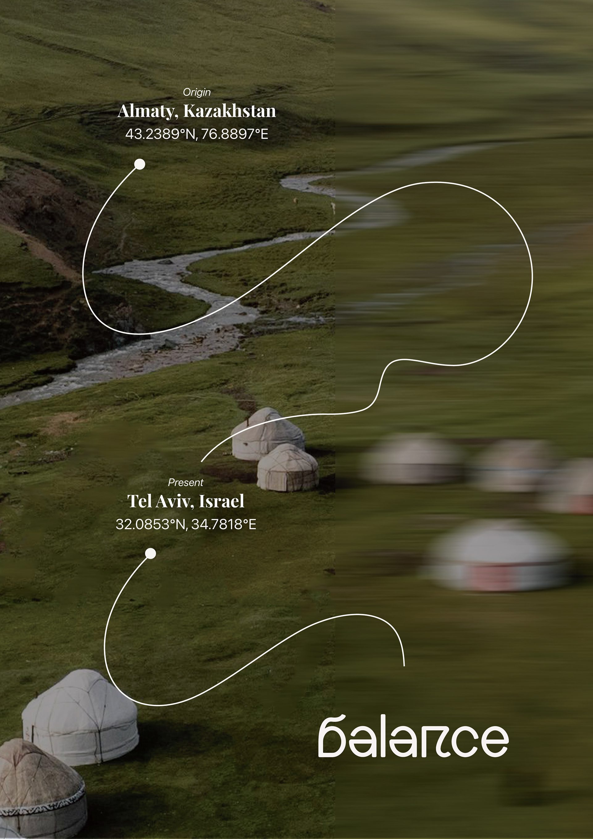
The Balance logo was created with letterforms inspired by the Kazakh alphabet, preserving the brand’s cultural roots while making them accessible to a contemporary audience. The letters were adapted into the brand’s linear visual language, connecting them to ideas of journey, movement, and mobility.

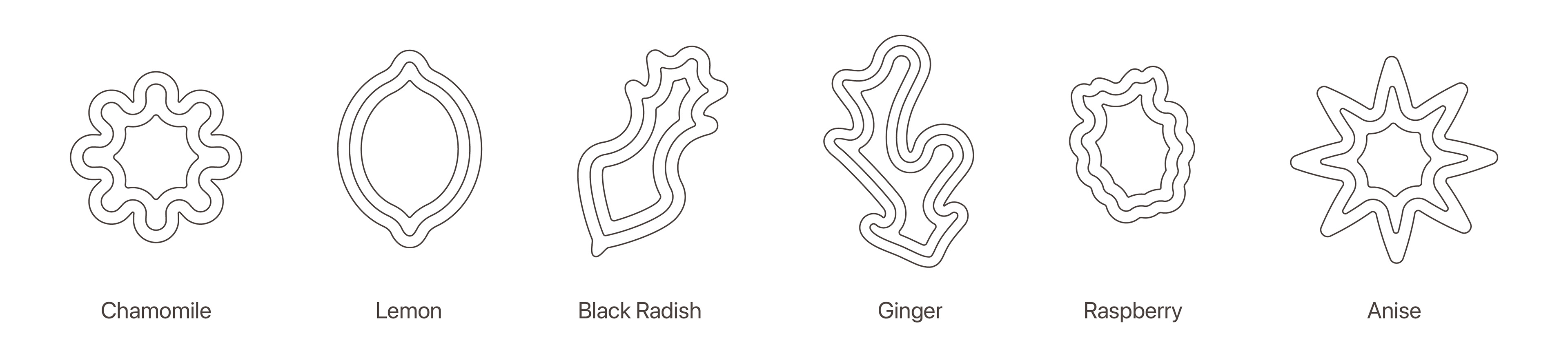
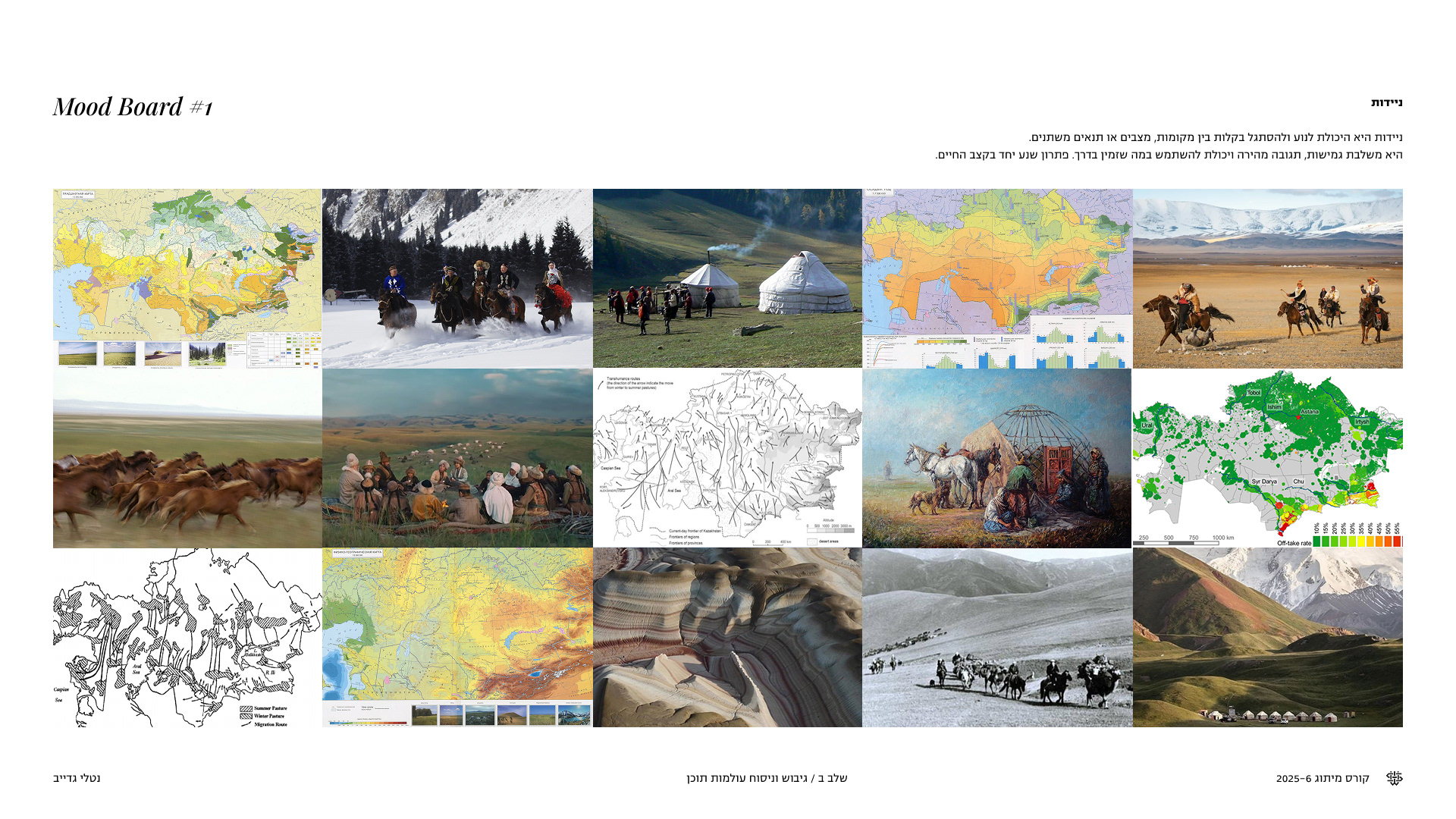
As part of defining the brand identity, I wanted to create a visual language that communicates movement, journey, and process. This connects both to the cultural story of traditional remedies traveling from Kazakhstan to Israel, and to the idea of a pharmacy as a place connected to gradual, natural healing. During the research phase, I looked at references from nature, with an emphasis on topography, maps, and organic routes.